
Microvolunteering Through Gamification
My team was asked to define the design system of Voluntopia. Voluntopia aims to get users excited about microvolunteering, while also encouraging real-world impacts via digital rewards.
Microvolunteering is when individuals complete small tasks, a few minutes to a few hours in duration, that are part of a larger project.
Ultimately, this is a gamified product that aggregates microvolunteering services to be completed in the real world in order to incentivize time-strapped users to continue engaging in volunteer opportunities by being able to unlock more and more features as they volunteer.

The Challenge
Evoke positive emotions toward volunteering while being accessible to mobile users on the go
- Establish and extend the brand experience
- Encourage users to get involved through visual brand experience
- Define a scalable design system that ensures future consistency and alignment
- Establish clear navigation and interaction to maximize users’ time
Brand Principles

Catalyze
Spark an interest
in users
Simplify
Cut through the noise,
curate the experience
Retain
Keep users engaged and
coming back for more

Persona: Jessica Lane
- Needs to feel like she is having an impact on her community
- Needs to feel like her time is valued
- Unable to find volunteer activities that accommodate class and work schedules
- Felt underutilized in her previous role as a volunteer
- Motivated by learning new skills and getting better acquainted with her community
Style Directions
My goal when creating these design directions was to motivate volunteering through bright colors, bold shapes, and friendly illustrations.
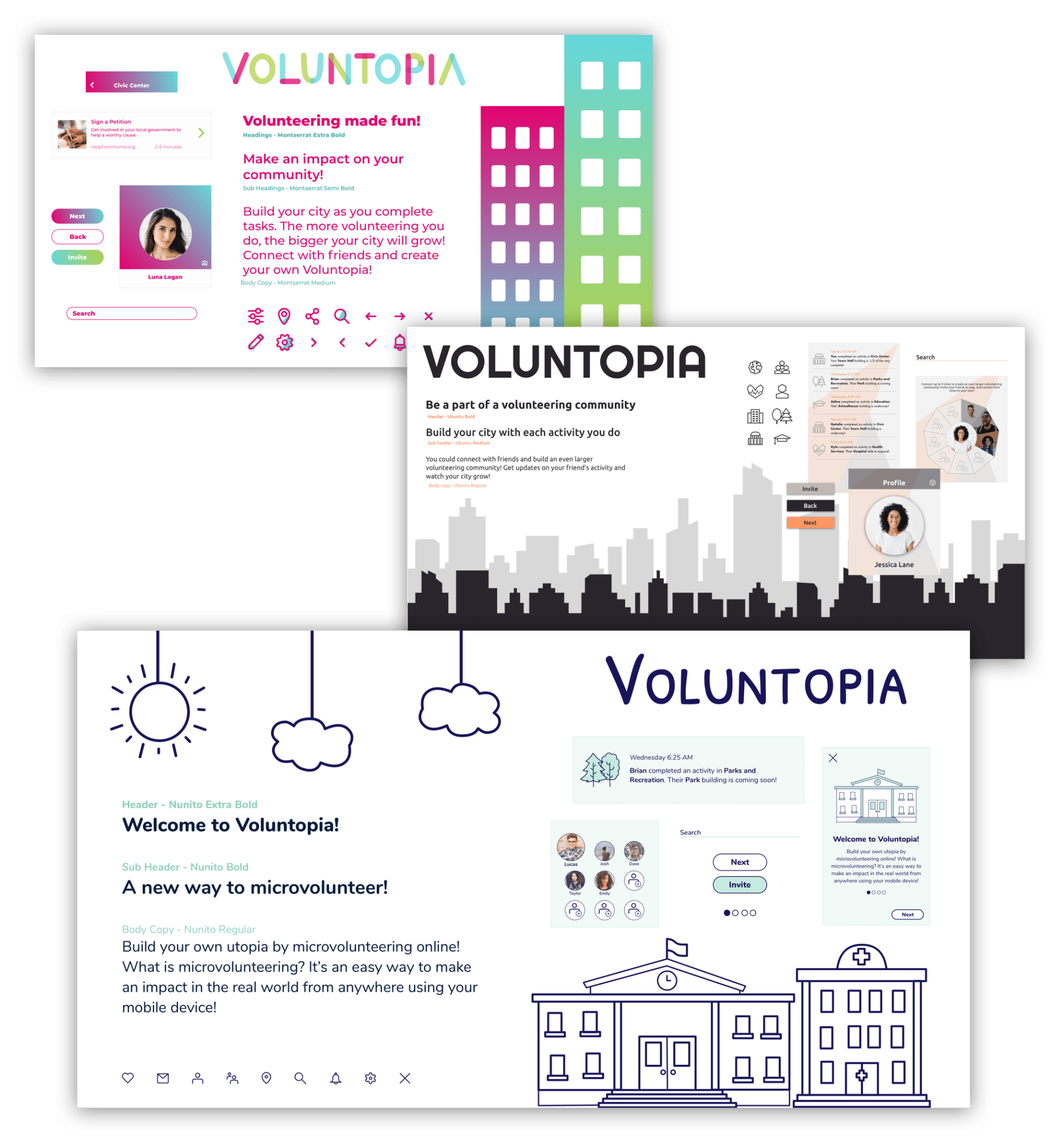
After conducting desirability testing, it was concluded that the line drawn and mint design direction was the one that I would move forward with for Voluntopia. Users found that this design was friendly, inviting, inclusive, and aesthetically pleasing.
Wireframe Iterations
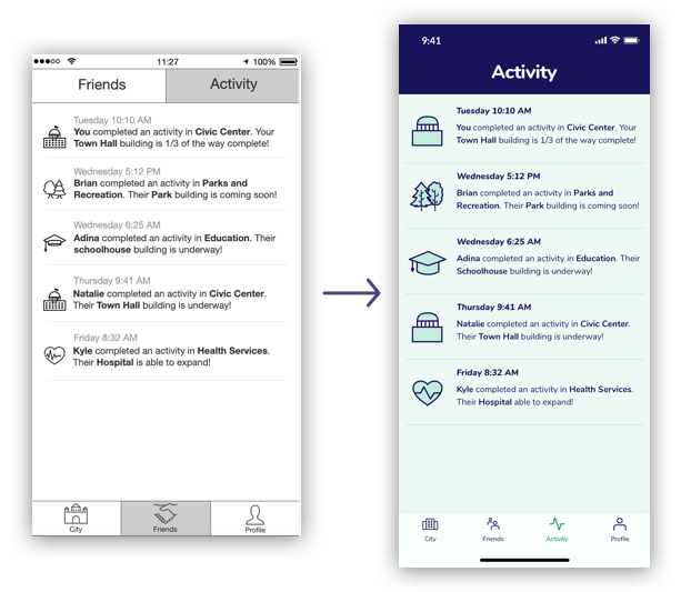
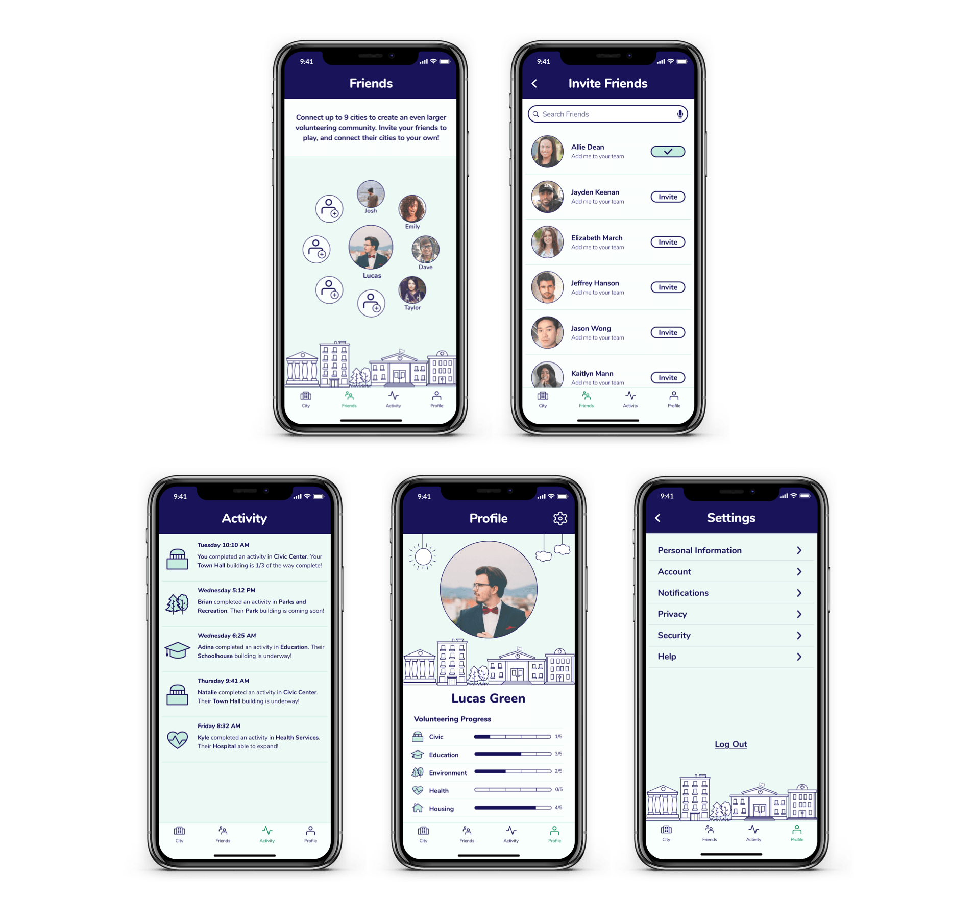
Previously, the wireframe that was given to us had activities tucked away in the friends tab. This posed an issue of being non-intuitive for users, so I moved the activities section to the bottom nav, so that it will be easily accessible.
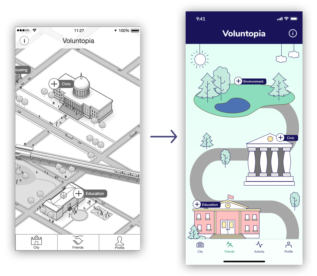
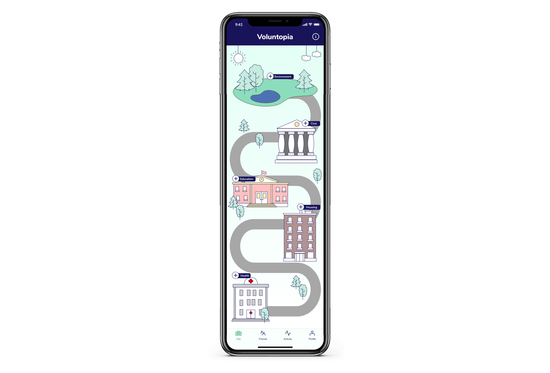
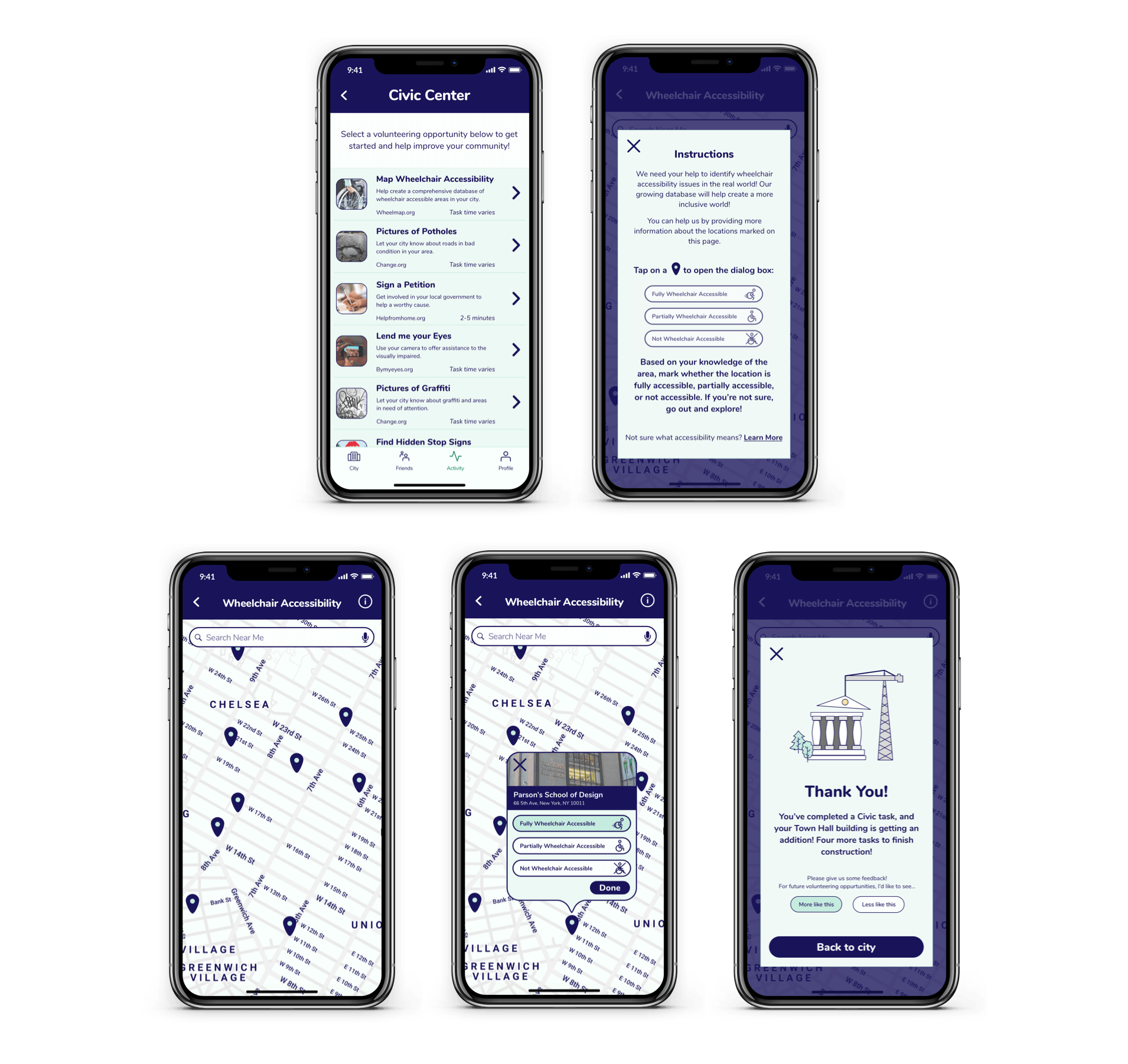
The UX team gave us a wireframe with a 3D map. Because this app is meant for busy people on the go, I wanted the map to be easily navigable with one hand. I created this 2D map so that users could scroll with one hand. I also created illustrations of buildings that are more in line with the style of the app.
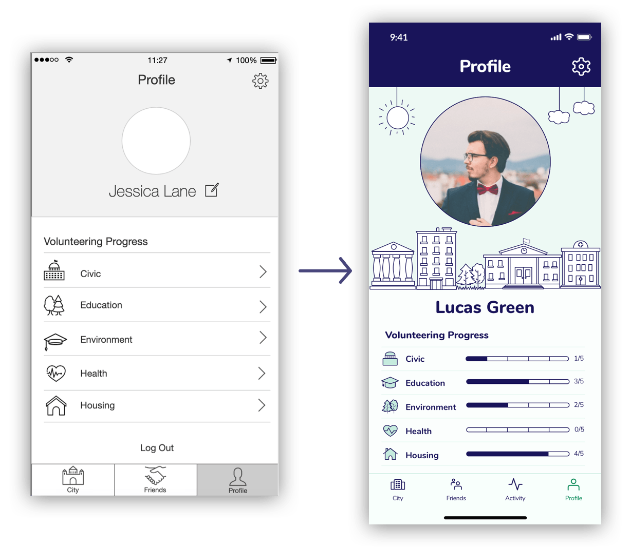
The profile wireframe that was given to us had volunteering progress lead the user to another screen. For my iteration, I added progress bars so that users could see all of their progress at once, and don’t need to go to a new page. With the separations in the progress bars, users could clearly see how many activities they need to complete to level up.
High Fidelity Mockups
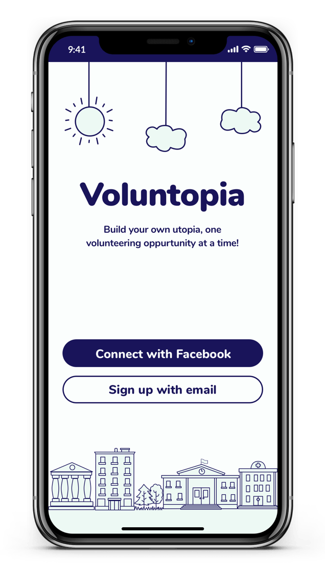
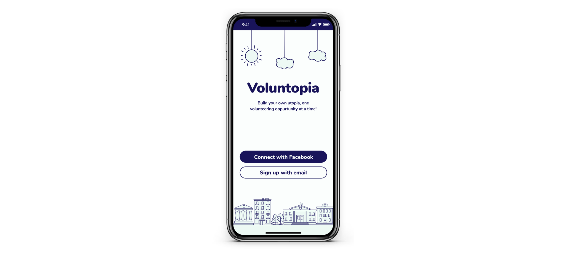
Signup
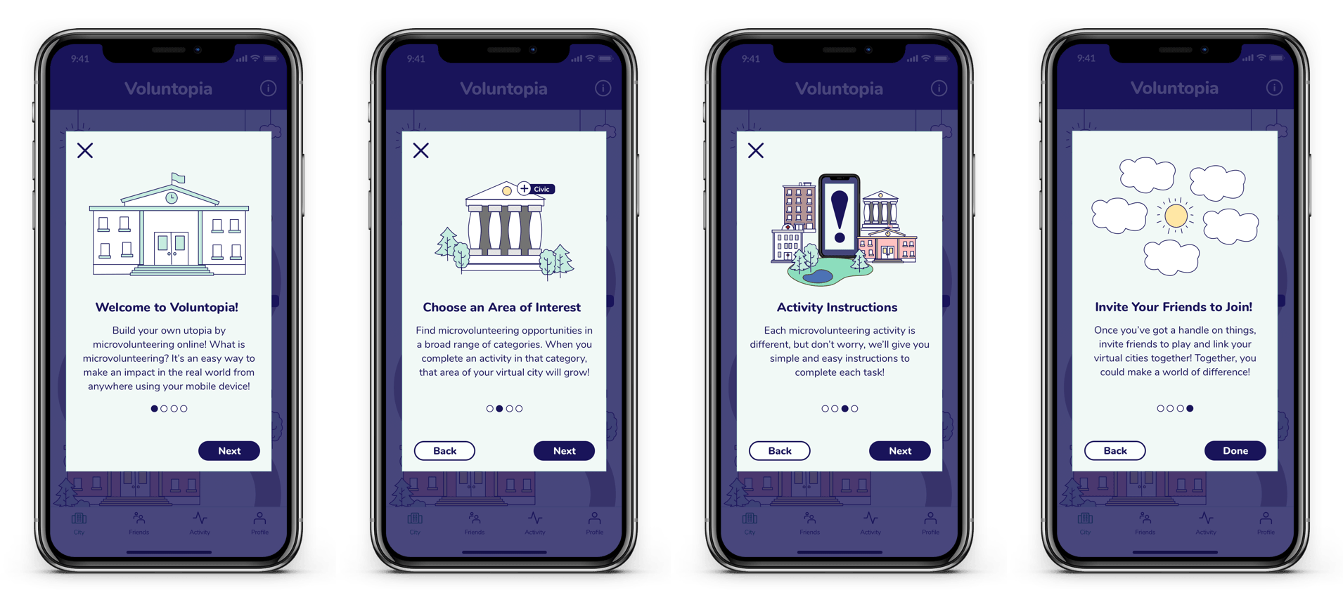
Instructions
The City
Selecting & Completing a Task
Friends, Activity, & Profile