

An app for finding events and groups based on your hobbies and interests in your area.
Skills: User Interface Design, Logo Design, Prototyping, Style Guide, Responsive Marketing Web Design, Branding
Tools: Sketch, InVision, Adobe Photoshop, Adobe Illustrator
Timeframe: 5 weeks
The Goals for Vente
The local scene is experiencing an overload of shareable information. Today’s consumers are over saturated with local events, meet-ups, and group activities. Despite the endless sea of happenings, people continue their struggle to find activities that align with their personal interests.
I was asked to create the visual design for a mobile responsive platform that reimagines how people can search and find activities that reflect their interests.
The Challenge
Create a platform where people could search for groups and events based on their hobbies and interests.
- Review wireframes and rework information architecture
- Establish a full brand feel, including logo design, based on research and usability testing
- Define clear organization of all features
Design Principles
Approachable
Make the interface friendly so
users feel comfortable using it
Bold
Excite users with bold colors
and overlays
Informative
Be clear and concise with
essential information
Personas

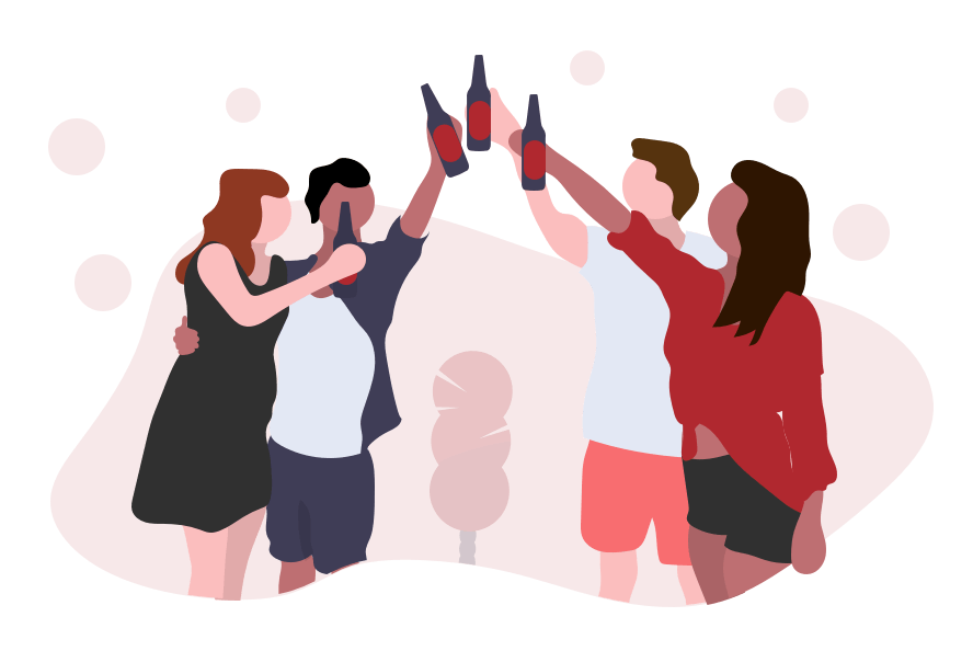
Nate Young
Motivation: Staying current with the local scene
Goal: Get a complete scoop on local classes, meetups, and events
Frustration: Too much happening at once locally
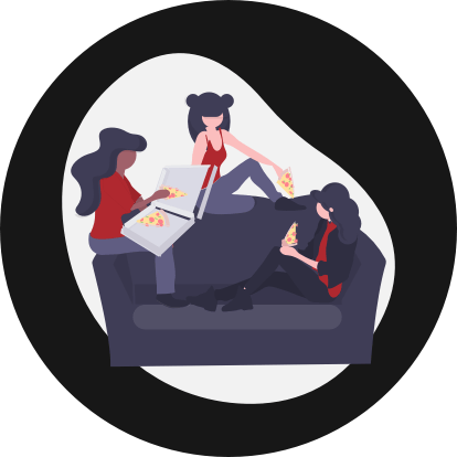
Amy Grant
Motivation:
Have fun and stay healthy
Goal:
Stay Active and up to date
Frustration:
Lack of time to search for local events

Logos
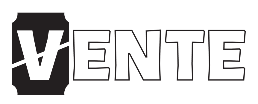
Logo 1 - Ticket

Logo 2 - Spotlights

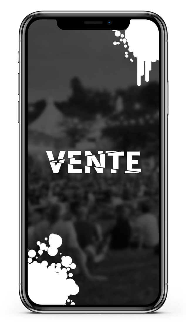
Logo 3 - Shattered
This was the chosen logo by the client.
Inspired by the different events that users could find on Vente.
They all come from the same place, but go in all different directions.
Style Directions
I created three divergent style directions for Vente. My goal was create designs that embodied excitement in different ways. I wanted to give the client various options of where to take the brand.
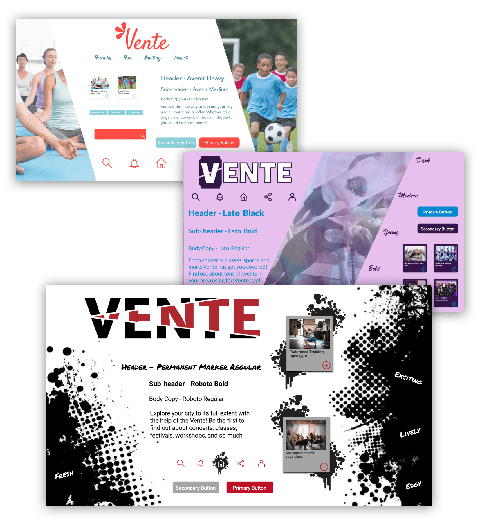
The final style that was chosen was inspired by grunge underground. I wanted users to feel as though they are a part of something exclusive. A challenge with this style was keeping it friendly while also incorporating the exclusive feel.
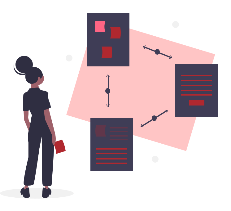
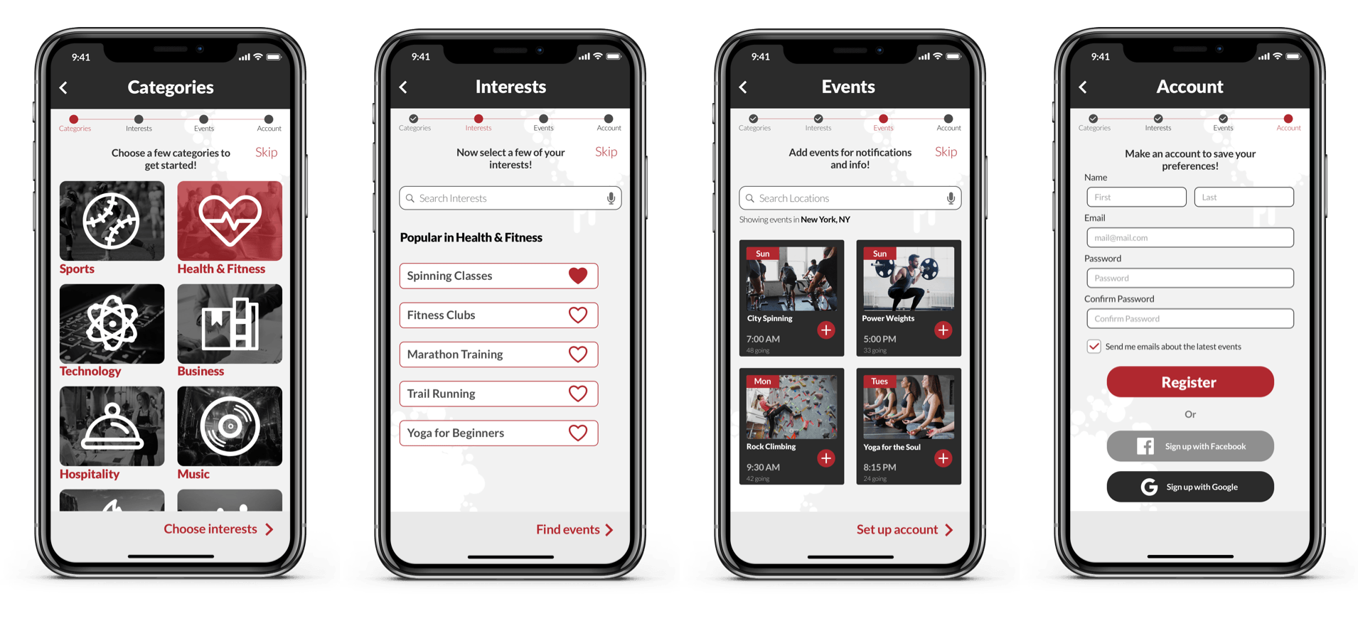
Wireframe Iterations
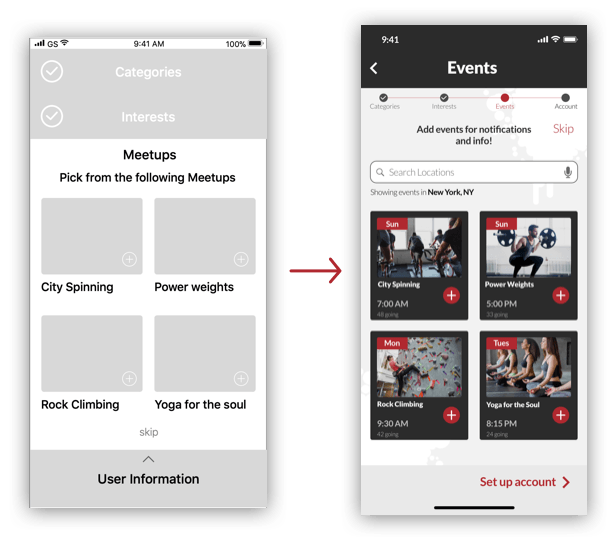
After reviewing the wireframes given by the UX team, I decided to make a few changes in order to enhance usability. I changed the stacked user progress to a small progress bar in order to increase room on the screen. I also added a search bar for location. I moved the skip button to the top of the screen, because it was confusing being so close to the user information. Lastly, I changed the swipe up motion to a click in order to make the interface more familiar to users.
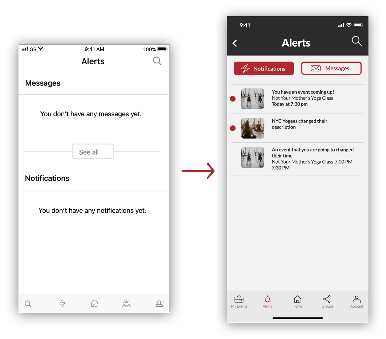
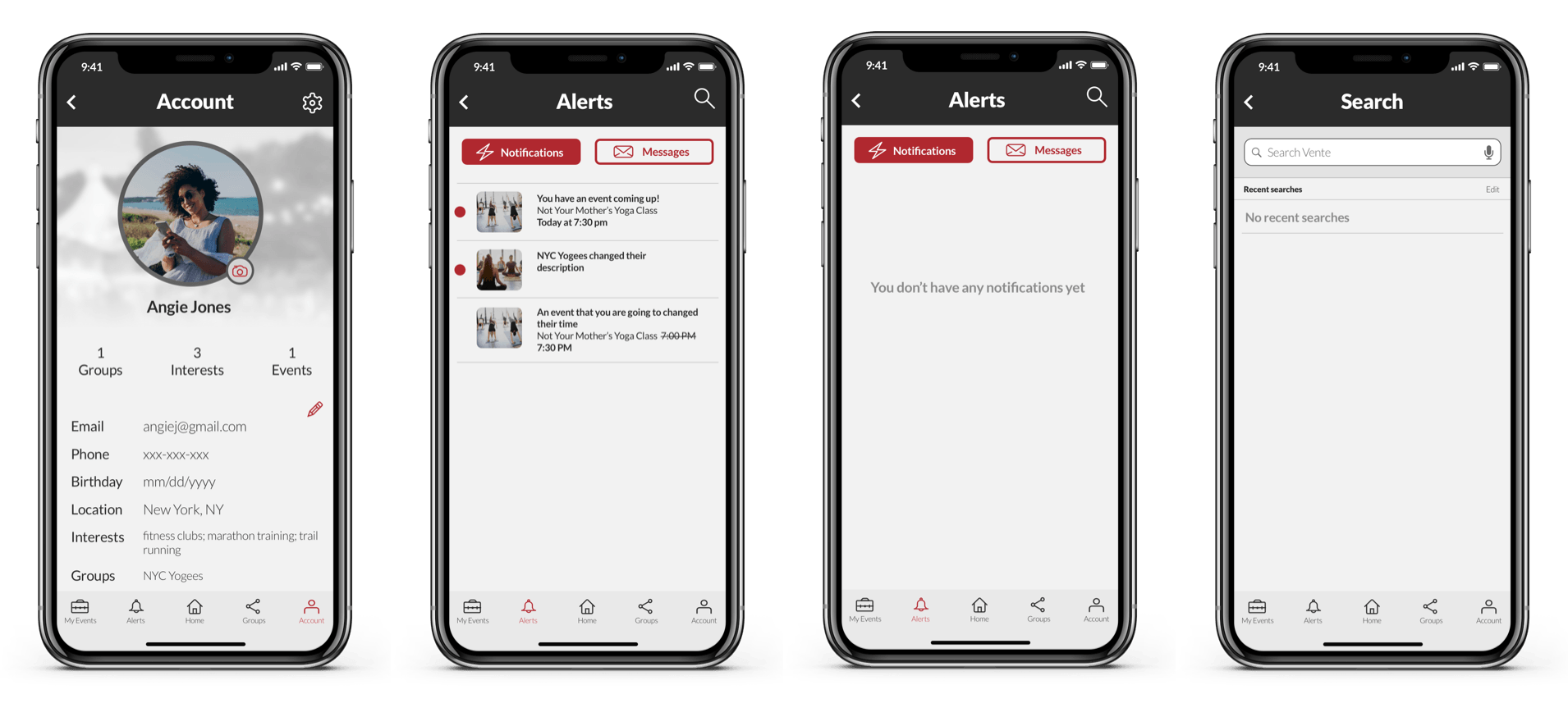
The alerts screen on the wireframes had messages and notifications on the same screen and stacked on top of each other. This setup might have been an issue once there was content. Instead, I created two separate tabs for the functions for better organization.
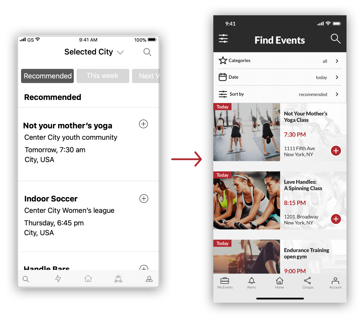
I made a few changes to the events wireframe while designing the high fidelity screen. I took out selected city and made that a setting in the profile. I also removed the tab bar to sort the top, and created an icon on the top nav, which will give the user a menu to filter and sort. I felt that the tab bar would cause frustrations for users if they would want to filter and sort by multiple things. Lastly, I added photos on the cards, and a small red box in the corner so users could quickly see when events are taking place while scrolling.
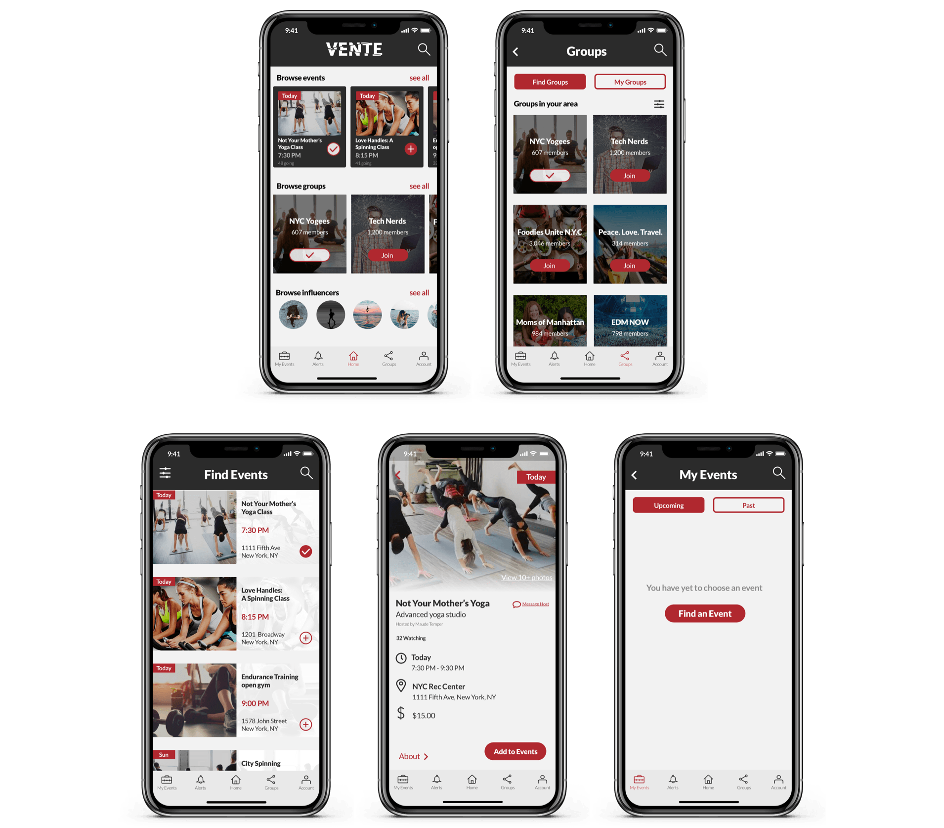
High Fidelity Mockups
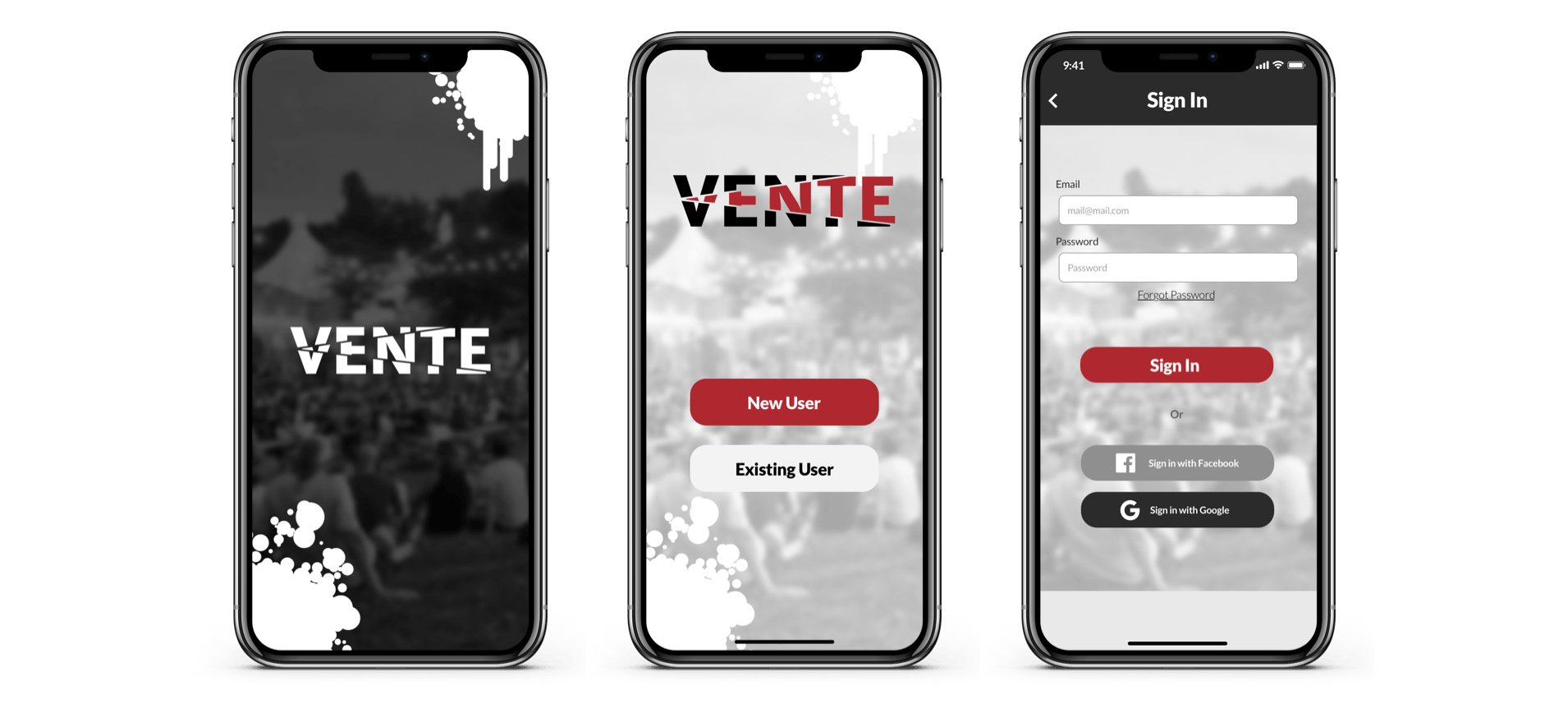
Splash Screen & Login
Onboarding
Home, Groups, Events
Profile, Notifications, & Search
Future Recommendations
Influencers feature:
With more time, I would have expanded on the influencers feature. There wasn’t much clarity on any of the wireframes, and I had to interpret what to do with most of the features. The influencers was one of them. I would have liked to expand on exactly what influencers are, and how they fit in with the design principles of Vente.
Instructions:
The vital screens of the app were created, but with more time, I would have liked to create an instructions or help screen for more clarity for users who needed it.