

The Goals for FitTripper
FitTripper is a service for travelers and locals to find short-term gym passes without committing to a contract. The company is based in Southeast Asia and Latin America. Their primary mission is to make it easy for users to work out at any time in any place. The app is great for travelers, or anyone who wants more variety in their fitness routine.
FitTripper already had a website, but wanted to redesign their beta app. Carol and Rob, the owners of FitTripper, had a few new feature ideas that had not been implemented into their design. They wanted to add a retreats booking page, as well as a personal training and class option.
The Challenge
Redesign the FitTripper app while ensuring it is gender neutral, motivating, and high quality.
- Implement new booking retreat feature and distinguish the information architecture
- Rework organization of buttons and options on explore pages, and implement a new way of switching between categories
- Leave space for company growth and create full style guide for future use
Competitive Analysis
Our team conducted a competitive analysis to see what might work, might not work, and current trends.

- Strategic use of whitespace
- Motivating stock photos
- Familiar layout

- Motivating colors and gradients
- Efficient organization of buttons
- Descriptive icons

- Inconsistent whitespace
- Inconsistent icons
- Confusing navigation
Design Principles
Familiar
Be a home away
from home

Inclusive
All genders should
feel welcome

Motivating
Energize users through
the interface
Style Directions
I wanted to push the limits of the brand when creating these style tiles. I took the boldness of the designs that we researched and the fluidity of the sample apps that Carol and Rob showed us, and produced three divergent design directions.
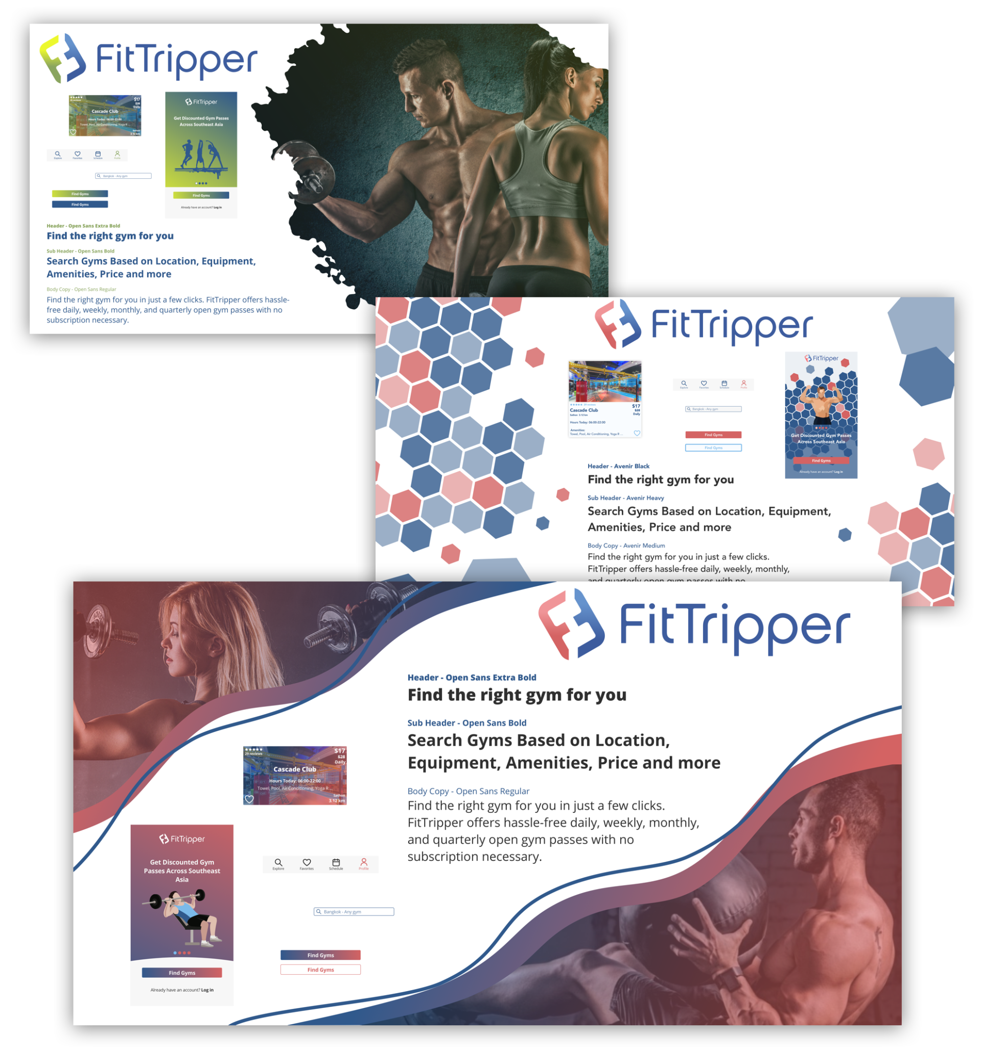
Users responded best to the curves and gradients of this style tile. They loved the real photos of people working out, and felt the gradients gave the content an energy boost. Users did not like the illustration, so I decided to leave that out of the design moving forward.
Design Decisions
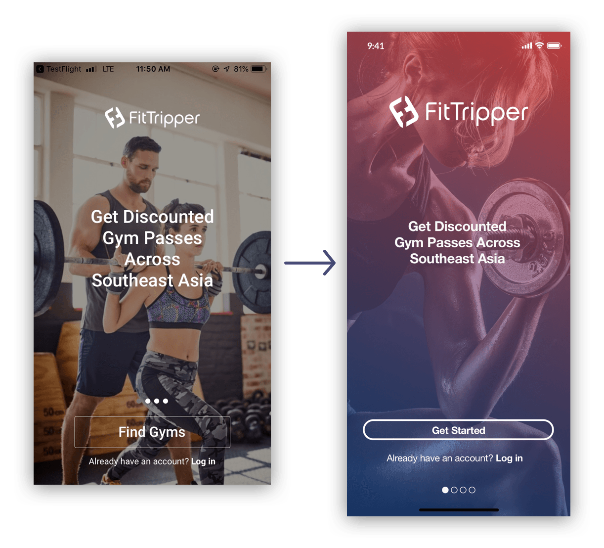
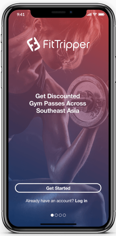
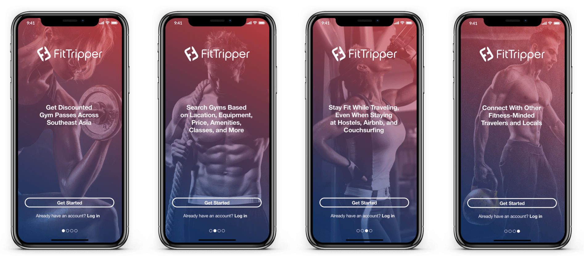
Users felt that photos of people working out were motivating, so I kept the photo background idea in the redesign of the intro screens. I added the brand gradient in order to have the style consistent throughout the app. I also thickened the border of the button to make it more accessible, and changed the wording from “find gyms” to “get started” because users were confused about this during testing.

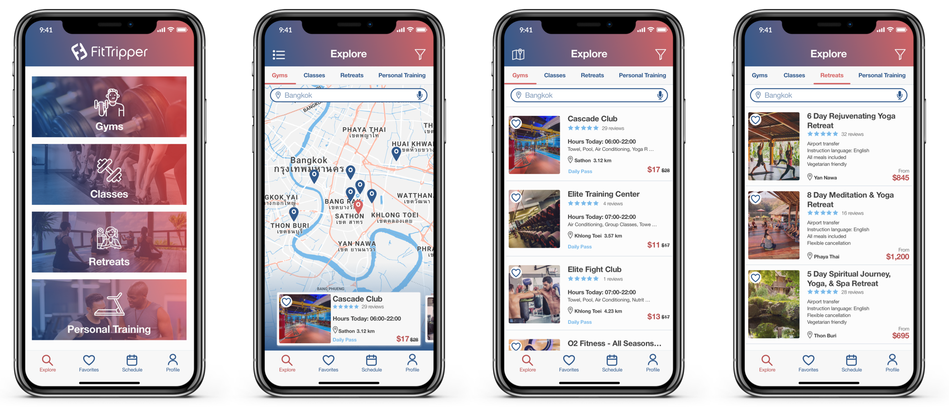
On the Explore page, I took the search bar out of the top nav so that users would be clear on what screen they are on. I also moved the map and filter buttons to the top nav, so that they would not get in the way of the content. I changed the size and layout of the cards, so that users could see more gyms at once without scrolling. Lastly, I included tabs on the top, which leaves room for expansion of the app.
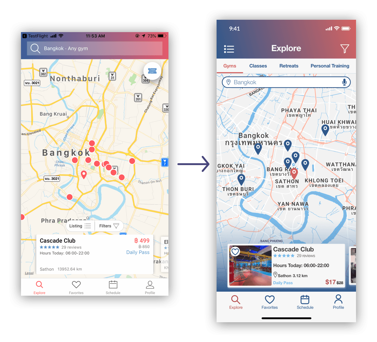
This is the map view of the gym page. Users could easily switch back to list view using the list icon on the top left. I created a customized map using the brand colors in order for this screen to remain consistent with the rest of the app. I also added a blue gradient in the back of the cards in order to make them “pop” and promote a hierarchy.
High Fidelity Mockups
Onboarding
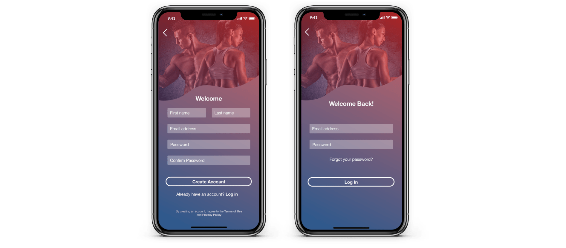
Log In & Sign Up
Explore
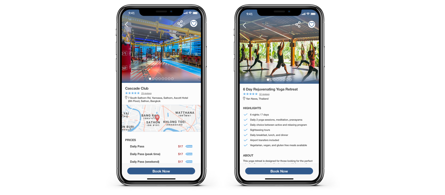
Gym & Retreat Info
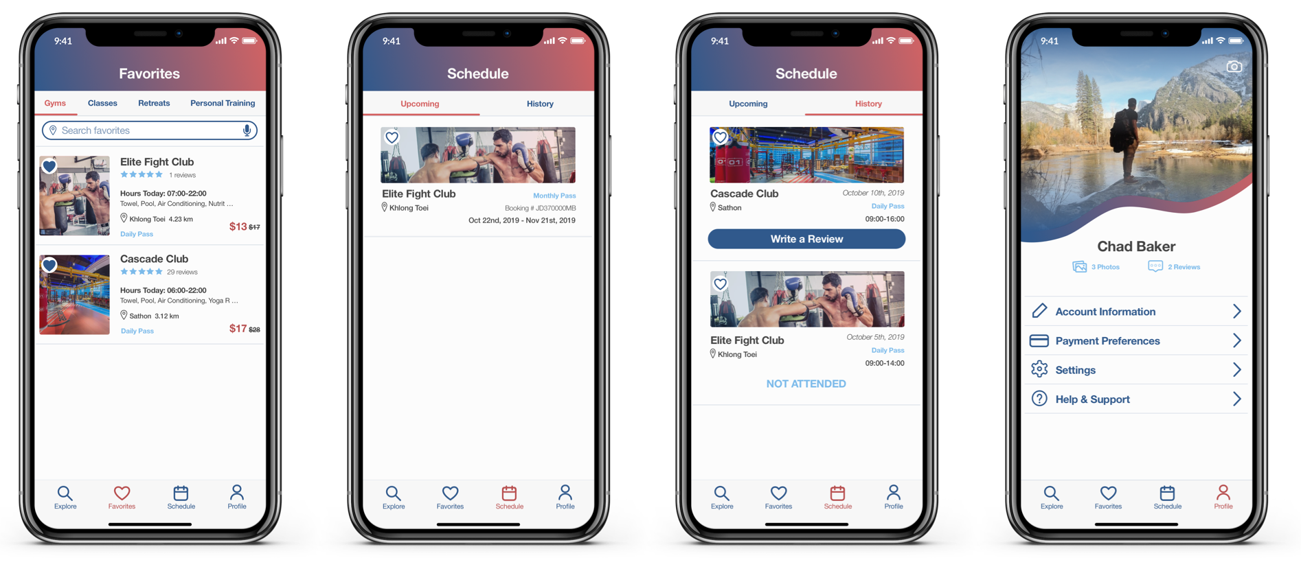
Favorites, Schedule, & Profile
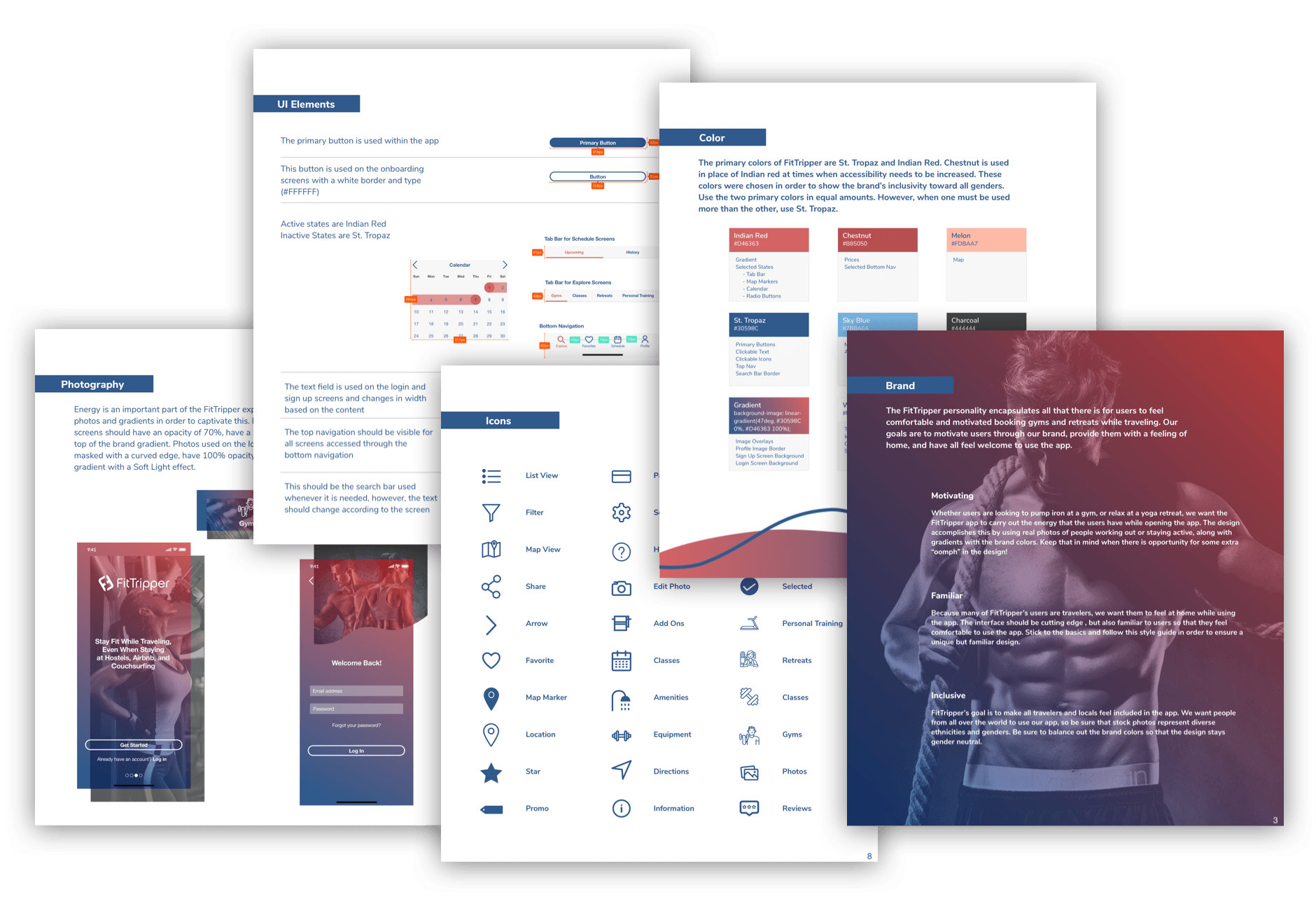
Style Guide
I created a design system that FitTripper could scale with in the future. I also built out some future sections of the site, which gave them room to grow their business with extra features. They were given a full UI kit and style guide so they will be able to implement those. With this style guide, FitTripper will be able to expand these designs as their brand grows, so that their new brand style will be able to grow with them.